> For the complete documentation index, see [llms.txt](https://docs.relevant-digital.com/llms.txt). Markdown versions of documentation pages are available by appending `.md` to page URLs; this page is available as [Markdown](https://docs.relevant-digital.com/general-platform/reports-and-dashboards/how-to-use-dashboards-and-reports.md).
# How to Use Dashboards and Reports
Compare dashboards and reports, choose the right format for your use case, and customise views for analysis.
Reports and dashboards use the same calculation module. They differ primarily in how they present data.
This functionality is available in Ad Revenue Insights (ARI), Header Bidding Management (HBM), and Header Bidding Analytics (HBA).
## When should I use reports or dashboards?
### Key Differences
| Dashboards | Reports |
| -------------------------------------------------------------------------------------------------------------- | ------------------------------------------------------------------------------------------------------------------------------- |
| Personal, drag-and-drop overviews on your start view. They are dynamic and best for real-time visual insights. | Reports can be public, for sharing, or personal, for your use only. They handle larger data sets and support in-depth analysis. |
### Dashboards and reports
* **Dashboards**: Use dashboards for easy-to-read overviews with charts and graphs. They prioritise visual, quick insights. Reports usually suit large tables with thousands of rows.
* **Reports**: Use reports for large data sets and detailed analysis. You can export them as CSV files. The export option appears at the bottom of each report.
Both dashboards and reports support different visual outputs, including line charts, bar charts, and pie charts. HBA reports also support geographical maps. The best option depends on the complexity of the data. For single- or dual-dimensional data, charts are effective. For more complex information, tables provide greater clarity.
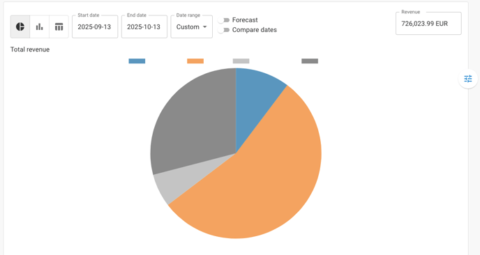
#### Example: pie chart
A pie chart works well for displaying a single dimension (for example, revenue distribution across websites).
#### Example: geographical map
In HBA, use geographical maps to visualise performance by country. Maps use the **Country** dimension. Combine it with other dimensions to analyse the data from different perspectives.
Use comparisons to track whether metrics increase or decrease in a country over time. You can zoom into an area and save the graph. This preserves the visual focus that matters to you.
For example, compare bidder performance by country. You can also compare demand types across countries.
### Dashboards
Dashboards provide real-time overviews of activity. You can create multiple dashboards for different needs. They often use graphs, but can also include tables.
Dashboards are dynamic. You can make changes without saving them. This makes them useful for quick adjustments.
There is no single correct setup. Start with these examples:
* **Revenue graph:** Displays revenue per day for the last month.
* **SSP revenue graph:** Breaks down daily revenue by SSP for the last month.
* **Site revenue table:** Shows revenue levels per site for the current month.
* AdOps users might go deeper, breaking this down by placement and focusing on the last few days to catch short-term drops.
* **Advertiser trend table:** Tracks top advertiser performance and trends.
These are just examples. You can customise your dashboard setup to suit your needs.
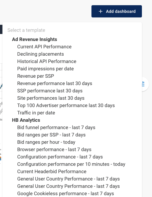
Ready-made templates can help you get started. Go to the **Dashboard** tab, select **+ Add dashboard** in the top-right corner, then choose a template.
### Reports
Reports support in-depth analysis, larger data sets, and data sharing. Like dashboards, the ideal setup depends on your tasks. Consider these examples:
* **End-of-month report:** Shows revenue per publisher or website, broken down by revenue type. If you are a programmatic network, this can be exported and shared with finance for invoicing. You can reuse the report by updating the dates each month.
* **Start-to-end report:** Tracks revenue per publisher from the start of your relationship. It provides a long-term performance view. A fixed start date and dynamic end date keep the report up to date.
* **Large advertiser reports:** Tables suit complex reports with detailed advertiser data. Split the information across report pages to keep it manageable.
For day-to-day investigations or optimisation, you might not need to save reports. These investigations often require detailed drill-downs. Try different table and graph combinations to find the right setup.
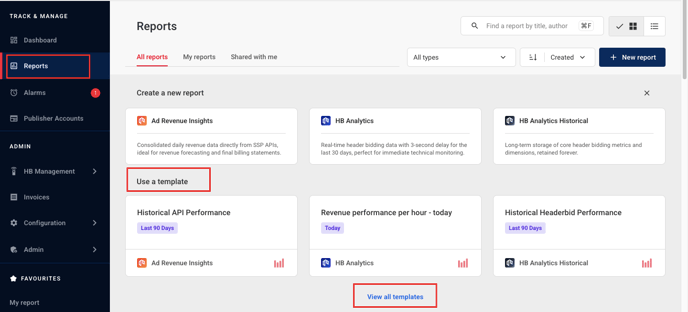
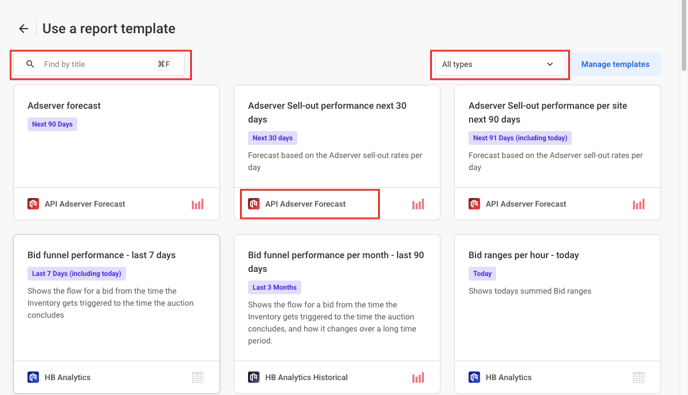
Ready-made report templates are also available. Go to the **Reports** tab and find **Use a template**. This section previews three templates. Select **View all templates** to see every template.
In **View all templates**, filter templates by module or search by name.
### Customising the graph view
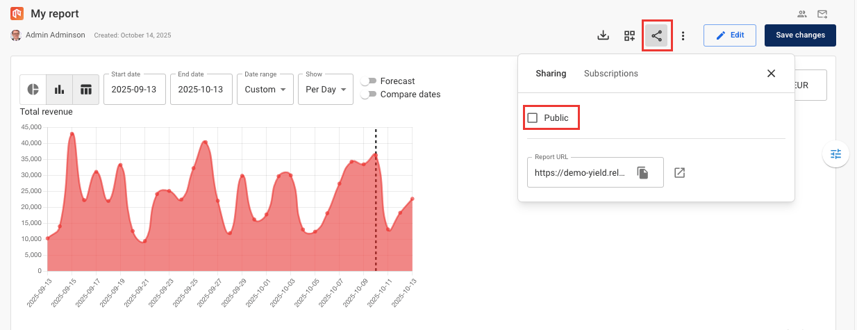
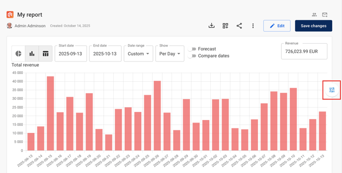
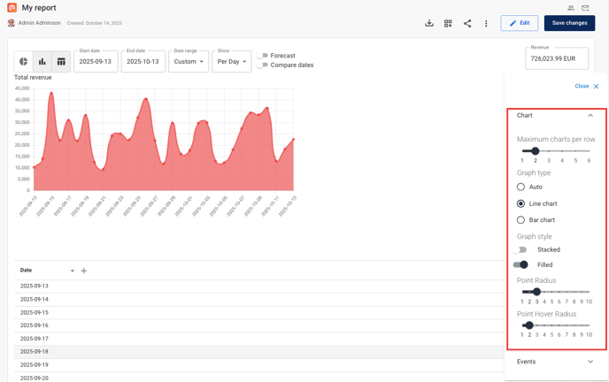
Dashboard and report views can display multiple graphs side by side. This makes data comparison easier. Use the settings next to each report or dashboard to customise the view.
You can display up to six graphs per row. Adjust the graph style to lines or bars. You can also change graph orientation.
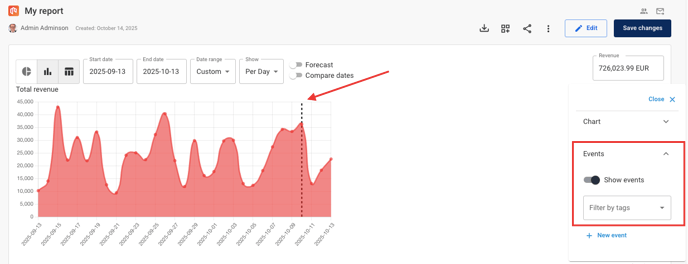
You can also display [events](/ad-revenue-insights/alarms-and-notifications/date-based-event-notifications-in-ad-revenue-insights.md) on the graph for easier tracking. A dotted line marks where each event was recorded.
---
# Agent Instructions
This documentation is published with GitBook. GitBook is the documentation platform designed so that both humans and AI agents can read, navigate, and reason over technical content effectively. Learn more at gitbook.com.
## Querying This Documentation
If you need additional information that is not directly available in this page, you can query the documentation dynamically by asking a question.
Perform an HTTP GET request on the current page URL with the `ask` query parameter, and the optional `goal` query parameter:
```
GET https://docs.relevant-digital.com/general-platform/reports-and-dashboards/how-to-use-dashboards-and-reports.md?ask=&goal=
```
`ask` is the immediate question: it should be specific, self-contained, and written in natural language.
`goal` is optional and describes the broader end goal you are ultimately trying to accomplish on behalf of the user. GitBook uses it to tailor the answer towards what is most useful for that goal.
The response will contain a direct answer to the question and relevant excerpts and sources from the documentation.
Use this mechanism when the answer is not explicitly present in the current page, you need clarification or additional context, or you want to retrieve related documentation sections.